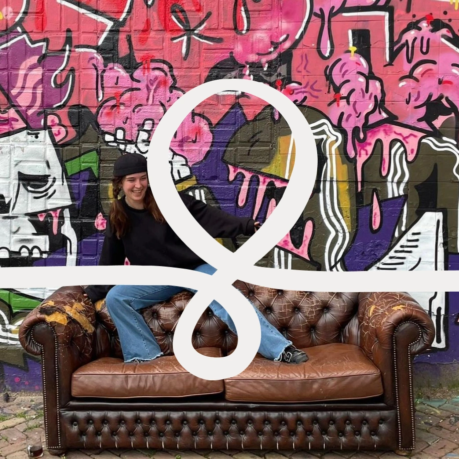
Couchsurfing
Reframing engagement for 14M+ users — from feature direction to behavioral design framework.
-
Client:
Couchsurfing
-
Year:
2023
-
Type:
Product Design
Behavioral Design -
Status:
Validated —
undeployed -
Role:
Sole Product Designer
(external, via Wolven)
I joined Couchsurfing as an external product designer through Wolven — scoped for execution: features, screens, delivery. Over the course of the engagement, it became a structural intervention that changed the product's direction.
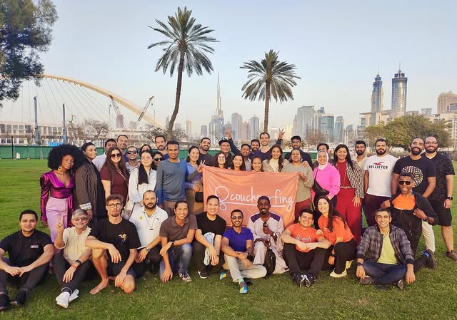
Couchsurfing in 2023 was a 14-million-member community platform under structural pressure. The world's largest hospitality exchange, built around a culture so distinct that members identified as "Couchsurfers" before mentioning their profession — not a user label but an identity. Originally free and collective, it had moved to a paid model during the pandemic — necessary for survival, still settling in with the community. The business tension was clear: staying unchanged risked stagnation; expanding wrongly risked finishing what the monetization had started.
The team was small, operating under resource constraints. Greg Knasel, Product and Analytics Lead, was adamant about one principle: pursue business goals, but never at the expense of Couchsurfing's ethos. Amanda (Community Support) and Mike (Marketing) — both long-time Couchsurfers with the deepest ongoing community contact in the company — were eager for new initiatives. The appetite for product-centricity was there, dormant, not dead. The capacity to act on it had been limited.
Couchsurfing already knew my work — I'd previously designed Hangouts ideations and a new Messages module. When they brought me back, initially to mentor a junior designer, they eventually chose to invest in seniority over lower cost — extending my hours and scope instead. That decision marked a shift. Previous external designers had operated in an execution-focused mode — translating requirements into screens, delivering what was asked. That's what the engagement called for, and it was delivered well. I started doing something different. I brought questions to proposed solutions. I suggested alternatives proactively. I pointed Greg toward the value of discovery before committing to final directions — using the previous Hangouts work as proof that the journey is part of the arrival.
This could have gone wrong. Some leaders resist when a consultant starts building on their direction instead of just executing it. Greg welcomed it. He kept ethos oversight and product direction — certifying that every initiative aligned with Couchsurfing's identity — while trusting me to drive product initiatives forward. We met twice a week to align on direction, and that cadence became the engine of the collaboration. I proposed separate recurring meetings with Amanda and Mike — biweekly, cross-departmental input that wasn't formally part of the product process. Through those conversations, community signal started flowing into product decisions in a way it hadn't before.
That signal surfaced the real problem. Couchsurfing's behavioral richness — hosting rituals, trust-building, cultural exchange, spontaneous human connection — was thriving in real life and barely present in the digital product. The platform was still a search and communication tool for a community that had long outgrown it. With 14 million registered members, activity signals existed but were buried behind laborious filters and imprecise indicators — profiles aged silently, search results mixed available hosts with members who hadn't logged in for months.
And the direction being considered would widen that gap.
Diagnosis
Among the inputs I was asked to assess was a product direction from a team retreat: a content feed built around travel expertise curated by outside contributors. Concierge-style articles about destinations — written not by the Couchsurfers who actually lived there, but by selected editors for a community with a history of pushback against top-down content initiatives.
The goal behind it — more engagement, a content layer, new revenue pathways — was correct. The problem was the architecture proposed to achieve it. A concierge model would produce content users consume but don't create. It would require constant editorial production with no self-reinforcing engine. And it would serve a job Couchsurfers hadn't hired the platform for.
Clayton Christensen's Jobs to Be Done (JTBD) framework clarified the stakes. Couchsurfers weren't hiring the platform for travel logistics or destination expertise. They were hiring it for belonging, identity, and unexpected human connection. The concierge direction would serve a different job entirely — and risk weakening the behavioral bond that kept members paying at a moment when the platform's relationship with its community was still recalibrating.
I presented Greg with the failure mode and, critically, an alternative architecture. Not just "this direction is dangerous" — but "here's what serves the same business goals without the cultural risk, and here's why." I then built alignment with Francesco (Director of Operations), Mike, and Amanda — the same cross-departmental relationships I'd been cultivating since the start — before moving forward to validate the direction with users.
The reframe: instead of designing content for the community, design the system that lets the community author its own content. Instead of inventing new behaviors, extend the rituals Couchsurfers already practiced in the real world. What Amy Jo Kim calls Purpose — "connectedness and relatedness with other people, with a shared cause, with something bigger than yourself" — was already Couchsurfing's retention driver. Consider what Couchsurfers had actually built: a social experience with the depth of an MMO. Rituals of hospitality, trust-building, spontaneous encounter, cultural exchange — except played not on a screen but in the physical world. Fourteen million members, a shared identity, behavioral depth most digital products spend years trying to manufacture — and it had emerged organically. The digital product hadn't caught up with what its own members had already created.
The question became: how to keep the business outcome goals intact while designing with the community's culture rather than apart from it. That's when the behavioral architecture took shape.
Approach
The behavioral architecture
The direction that emerged was grounded in what Couchsurfers already did — not new behaviors invented for them, but extensions of rituals already in practice. Every design decision maps to the behavioral loop Nir Eyal describes in the Hook Model — not because I applied a template, but because designing for existing rituals naturally produces the trigger-action-reward-investment pattern that drives habitual engagement.
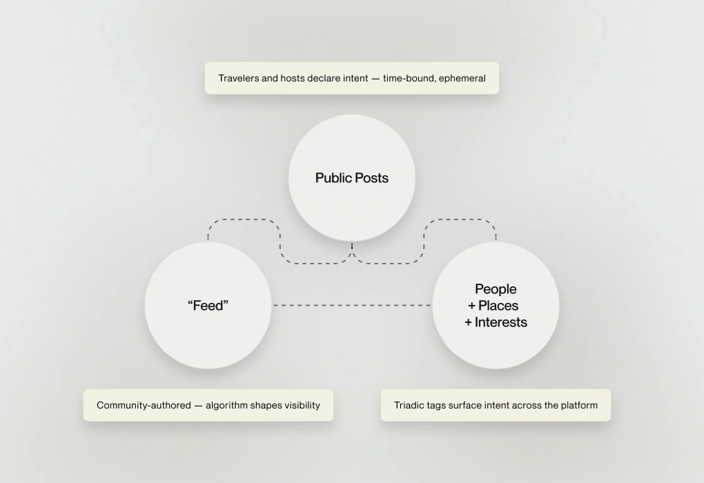
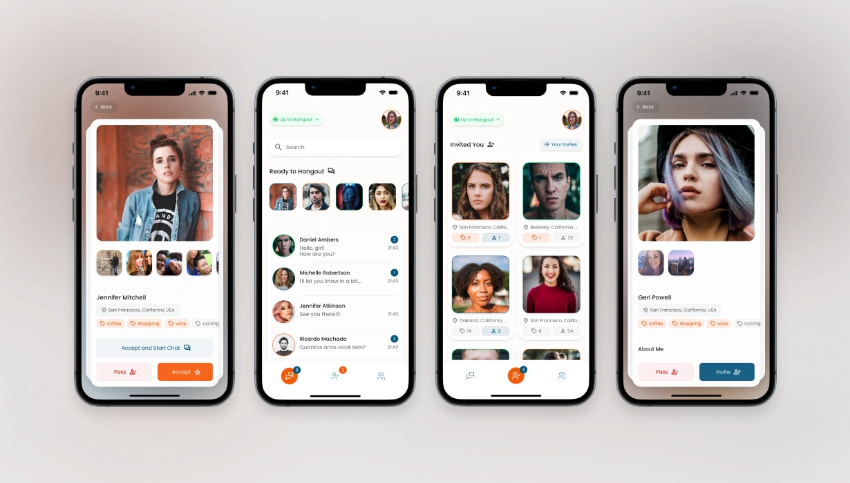
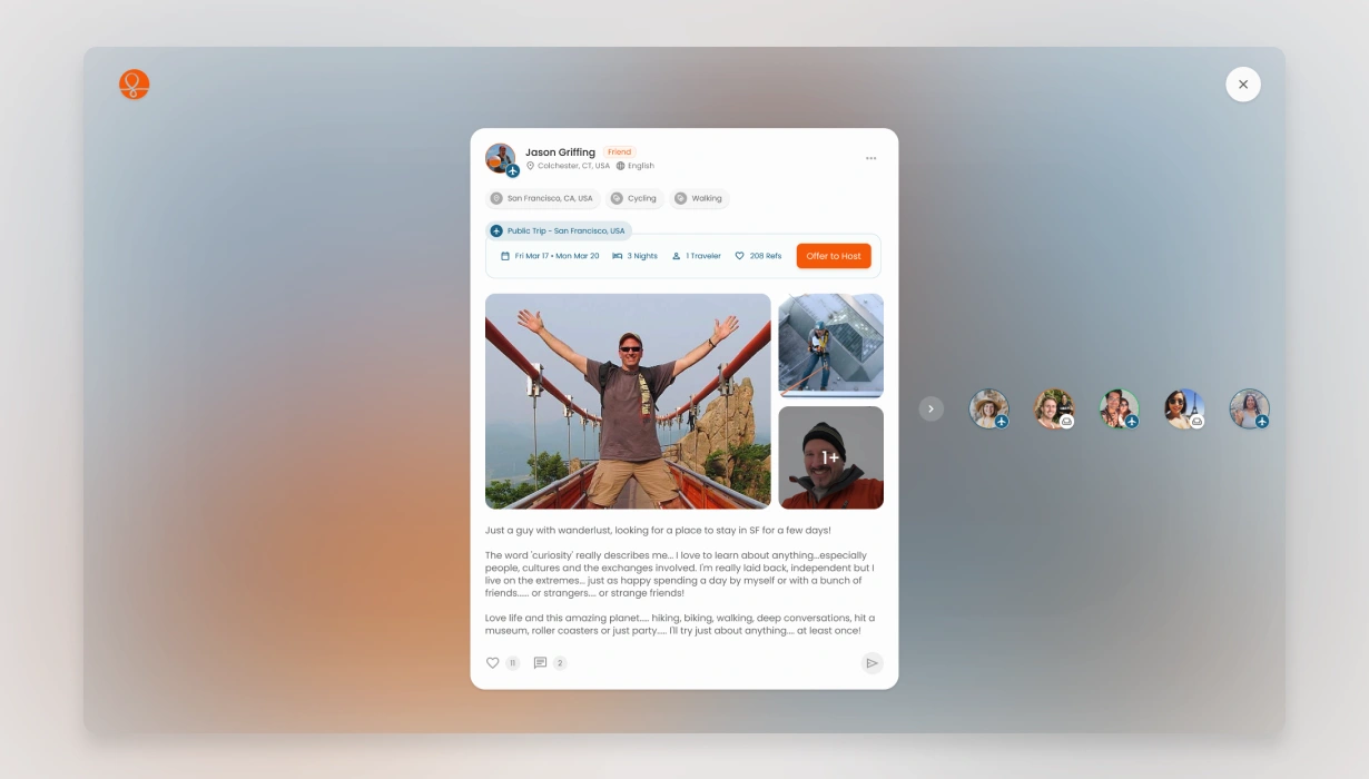
Public Posts replaced the legacy Public Trips system and expanded it fundamentally. Where Public Trips were static, traveler-only declarations, Public Posts became a unified system of intent for everyone — travelers signaling arrival, hosts declaring availability, locals expressing willingness to connect. One architecture, multiple purposes:
- For travelers and hosts: a direct, real-time connection channel replacing the labor-intensive manual search that had defined the platform for years
- For locals: a way to participate without hosting or traveling — expanding the audience without diluting the culture
- For the platform: the clearest real-time activity signal among 14M members. If someone posted, they're available right now — no filtering through stale profiles, no guessing from imprecise indicators. Real-time presence, architecturally enforced.
The behavioral mechanics reinforce each other. Temporal scarcity as trigger — posts expire, mirroring how real Couchsurfing encounters work: time-bound by nature. Variable reward — are there hosts available? Did new offers appear overnight? Is someone nearby right now, ready to meet? Investment — every declared intent compounds into social presence and reputation. And the symmetry between travelers, hosts, and locals means every audience has both a reason to participate and a reason to return.

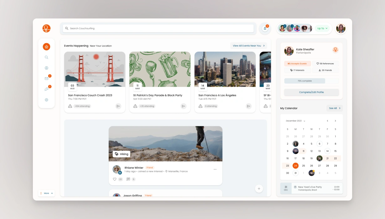
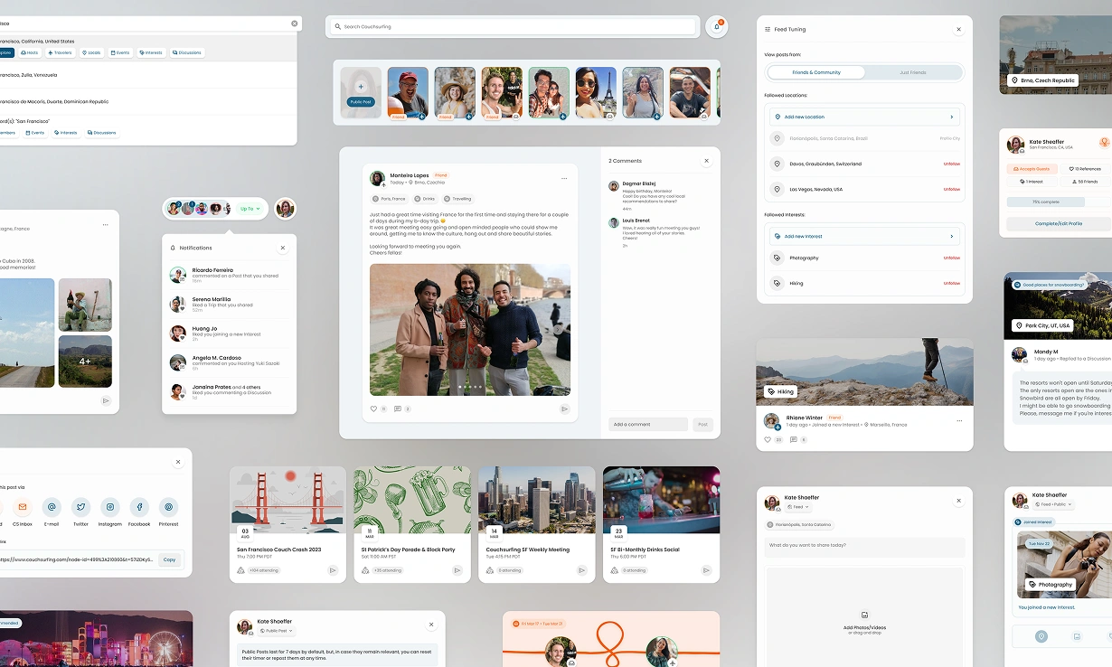
People + Places + Interests — the triadic tagging architecture — became the connective tissue. Posts surface through location and interest context, not a global feed. A traveler heading to Barcelona sees who's hosting, what interests are active, which locals want to connect — pre-trip intelligence generated entirely by the community, no editorial layer required. The silos that had plagued the platform for years dissolve into an interconnected, searchable layer of community-authored knowledge.
This triad solved the audience expansion problem the concierge direction had tried to address — but structurally. Locals discovering the platform through shared interests don't need to host or travel to participate. That's what Meadows calls a leverage point — a small structural change that shifts the system's behavior disproportionately. One architectural decision opened a new acquisition channel, created a natural upgrade pathway (visibility incentives for active participants), and expanded the user base beyond the traditional host/traveler pipeline — without editorial overhead.
The result: the behavioral architecture and the business model are the same design. Community-authored content drives the feed. Ephemeral posts create recurrent retention triggers — what Eyal describes as internal triggers forming through investment. Every behavioral decision is simultaneously a business decision, because they were designed as one from the start.
The design system that made it possible
Everything above was built in under twelve months. That speed was only possible because of the design system underneath — and that system had its own story.
Two previous internal attempts had failed. Both followed a waterfall approach: each component — color palettes, then buttons, then inputs — fully presented, approved, and documented before moving to the next. The components were sometimes strong in isolation, but the process made it impossible to evaluate how they worked together. A text input and a button side by side — one of the most common UI combinations — couldn't reliably produce matching heights across all their variations. The system had parts. It didn't have relationships.
I proposed a third attempt. Greg gave me one month to present a working concept to the full team — knowing that a third failure would likely end the initiative.
The diagnosis was structural, not aesthetic. Previous attempts failed because they built atoms first and hoped they'd compose well — a classic case of what Meadows describes as optimizing components while ignoring the system's interconnections. I inverted the starting point entirely. Instead of starting from individual components and hoping they'd form a system, I started with the Surface component: a pre-atomic foundation from which every other component would derive. Spacing, elevation, state, radius, color — all properties anchored to a dynamic base unit. This was 2023; Figma didn't yet support variables. Through inventive layering of sub-components and tokenized style references, the Surface achieved what variables would later provide natively: changing one parameter cascaded instantly across every component in the library.

That foundation made it possible to work in both directions — macro to micro, micro to macro — at any point in the process. Components could be tested in tandem during creation, not validated in isolation after approval. Color systems separated from anatomy kept the library legible at any scale and fast to iterate when everything needed to work together. The system could evolve coherently, not just grow. The same structural conviction that reshaped the product direction — start with the underlying system, not the visible output — had reshaped the design system too.
Approved after a single presentation to the full team — in a fraction of the time previous attempts had needed to approve individual palettes and buttons.
Scope
Built from scratch, coherently, by a sole external designer — enabled by the design system's speed and composability:
- New UI scaffold and interface architecture (legacy-compatible while advancing the visual language)
- Community feed and dashboard
- Public Posts system (travelers, hosts, locals — unified)
- Interests and triadic tagging architecture
- New search system and patterns
- New home page, onboarding flow, institutional CMS templates
- New Hangouts mobile app (independent product, separate from the main Couchsurfing app)
- Email and motion graphics templates
- Proposed tagline direction: "The world is your wave. Couchsurf it."
Outcome
The behavioral architecture was complete. The design system was operational. The prototype was built with real community photos and actual member posts — simulating the emotional texture of belonging, variable reward, and community investment the design needed to convey. User validation sessions were scheduled.
One week before they were due, a company-wide restructuring ended all external consultant engagements simultaneously — a structural decision that also affected leadership-level roles. Not a response to the work. The validation never happened.
But the architecture carried a structural advantage: every behavioral pattern in the system was drawn from rituals Couchsurfers were already practicing in the real world. Public Posts extended Public Trips. Interest-based connection extended how members already found each other at meetups. Ephemeral, time-bound presence mirrored how real Couchsurfing encounters naturally work. Designing from established rituals doesn't replace validation — but it reduces adoption risk structurally. When users already practice the behaviors, onboarding becomes recognition, not learning. Discoverability becomes intuitive. The distance between the product and the community's existing habits was already the shortest path to adoption.
What the work achieved:
- A behavioral architecture designed from community rituals, with business viability built into its structure — not two separate considerations, but one integrated design
- A strategic intervention that changed the product direction the company was about to take — from top-down concierge content to a community-authored behavioral system
- A design system built where two previous attempts had failed — approved in a single presentation, enabling the speed and coherence that made everything else possible
- A complete, development-ready prototype covering every product surface — by a sole external designer with no formal authority over product direction, operating on trust earned through quality and judgment
Greg later hired me for a personal project — a direct continuation of the trust built during this engagement.
The Lesson
Couchsurfing hired a consultant for product execution — features, screens, delivery. What they got was a designer who, with Greg's trust and ethos oversight, redirected a product strategy, built a design system where two attempts had failed, opened cross-departmental channels that hadn't existed, and designed a behavioral architecture that made the community's culture and the business's goals the same system.
That wasn't in the scope. It was in the conviction.
When the brief is ambiguous and a community's identity is at stake, the most important design decision isn't which feature to build. It's which problem to solve — and whether you're willing to own the right one.
Next Case:

WEG
Research-led redesign of a global quotation platform — prompting a 135-country organization to establish UX as a discipline.